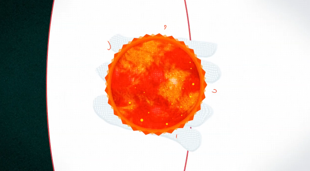
Speaking of colour, throughout the graphic colour plays a major part in keeping you invested, and ensuring that motion is smooth on the eyes[3]; 22 times the colour changes in a 60 second clip, yet due to com
plementing colours scene to scene it blends well. It separates scenes without seeming too garish, complementing the evolution of the information the narration provides, it gives the video a positive motion, you actively feel involved in the progression, it seems logical yet without it that progression would feel lost, or aimless.
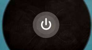
Narration is clear and concise, but does fall down in one particular area at around 0:34, where the narrator states “If an atom were the size of a stadium, its nucleus would be…” then a graphic of a power button is shown, as well as a small click sound effect. This serves absolutely no purpose, a football stadium, despite not being the best form of measurement does offer us a practical glimpse into a size we can realise, but there is no correlation between this, and a power button? Rewatching it multiple times I still struggle to understand how large a nucleus would be, for something that tries to cram as much information as possible into 60 seconds it just seems like a waste of time; it also doesn’t help the credibility of the rest of the information within the video, you can’t have a scientific topic but neglect to give factual information when referring to scales. This then follows into the next segment… “Worldwide there are around 2 billion people online” it just doesn’t offer the same flow as the rest of the video, where was the link outside the graphic. The transitions remain smooth, the music tempo remains constant, yet the narration seems to almost skip a section…Could this have been to save time after cutting, perhaps, overall though it seems they needed something more coherent to net these parts together.
It’s a real shame as the audio techniques[4] used carry the segments and transitions, the music is upbeat, and has a rather quick tempo to carry the movement of the video. Sound effects serve to compliment this, with relevant effects used to relate to the graphics present on screen. The only area that lets this down is the harsh cut to the background music present at 00:57. I know there are only 3 seconds remaining of the video at this point but a simple fade, possibly even into their client “The BBCs” signature audio sample would have finished of the video on a much more positive note. It just feels like a lack of polish in one of two areas let down an otherwise flawless audio segment, the sleek transitions just don’t match a hard cut to the audio.
Overall there is a lot to take away in a positive manner when it comes to the work ‘weare17’ their fluid transitions and gorgeous graphics serve as something I can strive to aim for, moreover the clear well-spoken narration mimics a style I’d like to adopt for my own work, however I would like to avoid these harsh cuts, and keep the video on topic, each aspect should be related to the last to keep that positive momentum. It ensures viewers don’t become distracted, and keeps some punch to the topic that harsh cuts and momentary lapses of flow can harm.